News
News | 4 min read
January 30, 2015
RICHMOND, VA – After 20 years of serving as the Richmond Region’s economic development organization, and more than 10 years with the same logo and branding, the Board of Directors of the Greater Richmond Partnership knew it was time for an update.
“Just like any organization or business, we have to assess our outward appearance to make sure we’re presenting ourselves in the most effective way,” said Greg Wingfield, founding President and CEO of the group. “Back when we unveiled the grpva.com logo, it was cutting edge. Ten years later and it’s not so much,” he joked.
The Partnership’s Brand subcommittee consisted of public and private members of the Board of Directors, the four local economic development officials and key staff members. Chairing this committee was Hanover County Supervisor Angela Kelly-Wiecek, Chickahominy District representative.
The Partnership’s new branding was performed by PadillaCRT. The Partnership’s last brand update occurred in 2004, with an emphasis to playing off of the 400th anniversary of the founding of the Richmond Region. It was part of the “Historic Richmond: Easy to Love” concept developed by the Martin Branding Worldwide, to provide a cohesive, regional brand for several non-profits in the area including the Richmond Metropolitan Convention & Visitors Bureau, Richmond International Airport and more.
“When we began considering an updated look for the Partnership in mid-2014, we called Mike Mulvihill and PadillaCRT, a longtime supporter and investor,” said Wingfield.
PadillaCRT provided in-kind investment to accomplish this time-intensive project, also giving a deep discount to the non-profit group.
“A thriving, prospering Richmond Region is in the best interests of everyone who lives and works here, and we were happy to have led a collaborative branding process that will help the Greater Richmond Partnership put our region’s best foot forward.” said Mulvihill, Executive Vice President at PadillaCRT.
The Partnership’s initial conversations were much like any other business. The group questioned if it was providing a clear message of the organization, its mission and value to its clients.
After interviewing 24 local officials, site selection consultants, investors and stakeholders, PadillaCRT developed quantitative research on the Partnership that had only been performed by word-of-mouth during meetings, introductions and assumptions.
 “We needed anonymous, honest feedback and this exercise accomplished that perfectly,” said Kelly-Wiecek. “We heard wonderful things about the staff’s professionalism, organization and how they market the region as a product. Many of the brand challenges mentioned during the interviews are being addressed through PadillaCRT’s advisement.”
PadillaCRT’s group of professionals, including Kelly O’Keefe, Christian Munson and Kevin Flores, developed branding based on a simple concept: regional prosperity.
Its functional message is constant – to promote the Richmond Region – but its emotional message aims to bridge the gap between company recruitment and how it affects the region’s residents. By adopting “Prosper Here” as its tagline, the Partnership allows the message to evoke an inspirational position to its clients and its stakeholders.
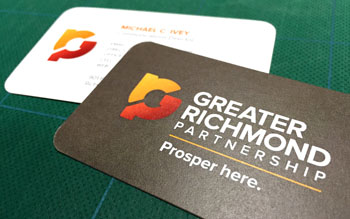
“Every facet of the new brand was built upon this positioning,” said Kelly-Wiecek. “The color palette, logo and collateral all have a clean, contemporary look that we were looking for. The new brand evolves elements found in our old look, but provides a completely new aesthetic.”
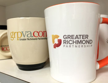
Included in the logo are brighter, more energetic colors than the historic-themed color palette found in the group’s retired materials. The GRP mashup icon was designed with the popular RVA logo in mind, and used a similar typeface. The diagonal opening between the shapes has an intentional upward motion, to evoke inspiration and growth.
Barry Matherly, senior vice president of the Partnership, who was recently named successor to the President and CEO position, sat on the branding committee. “This new look will propel us into the future with its energetic colors and design. I’m excited to have worked with PadillaCRT on this project, as a new era of the Partnership begins.”